
THE PROJECT
Food Stall Branding at Adelaide Central Market
Two market stalls, one clear brand. A colour-led food stall branding makeover that made Cumbia Bar Kitchen one of the most recognisable stalls in the market.
Client
Cumbia Bar Kitchen
Location
Adelaide Central Market
Scope
Two stalls: paint, logo & signage
Year
2025
THE BRIEF
It Started With a Touch-Up
Cumbia Bar Kitchen, a Latin and Mediterranean soul-food restaurant in the heart of Adelaide Central Market, asked us to restore the existing artwork on their two market stalls.
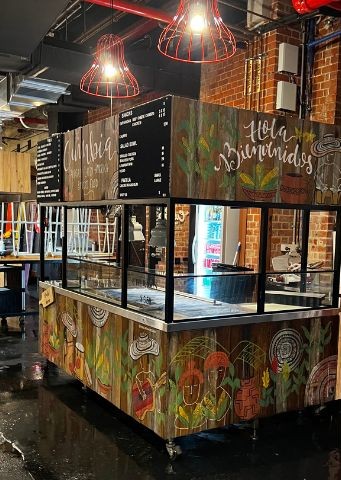
After visiting the space and listening closely, we saw the real challenge. The rustic, folkloric artwork outside clashed with the modern, vibrant restaurant inside. Customers were getting two different brands.
In a visually busy space like the Central Market, clarity is everything. So instead of a quick fix, we proposed a minimalist rebrand: less is more.
THE STRATEGY
A Colour-Led Branding Approach
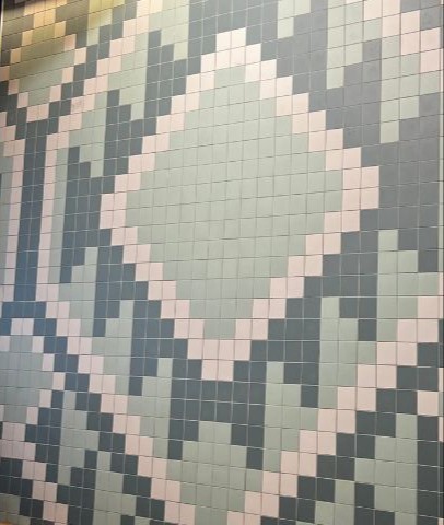
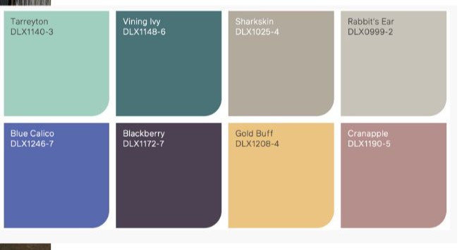
Together with the owners, we ran a colour analysis, drawing on some of the best restaurant designs in Sydney and Melbourne and on the green and grey tiles already inside the restaurant.
Soft greens and light blues projected freshness and modernity. We built a unified palette and realistic 3D mock-ups, then placed the Cumbia logo across multiple angles of each stall for visibility from anywhere in the market.
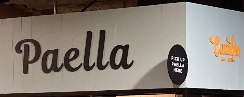
One stall cooked paella in two huge pans, but visitors weren’t sure what it was. The fix: a bold overhead sign reading “PAELLA”, clear from across the market.
THE PROCESS
Built to Handle a Busy Market
Food stalls take a beating, so the finish had to be as tough as it was good-looking.
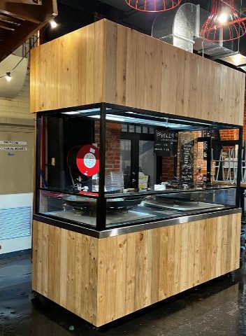
1. Sanding
We sanded the stalls back to bare timber and degreased every surface, removing the old artwork completely.
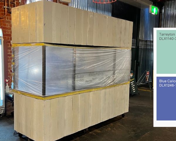
2. Seal & prime
A sealant and primer went on next, with the glass and equipment fully protected.
3. Colour
We tested palettes with the owners, then applied three coats of Dulux Super Enamel for a hard-wearing finish.
4. Logo & signage
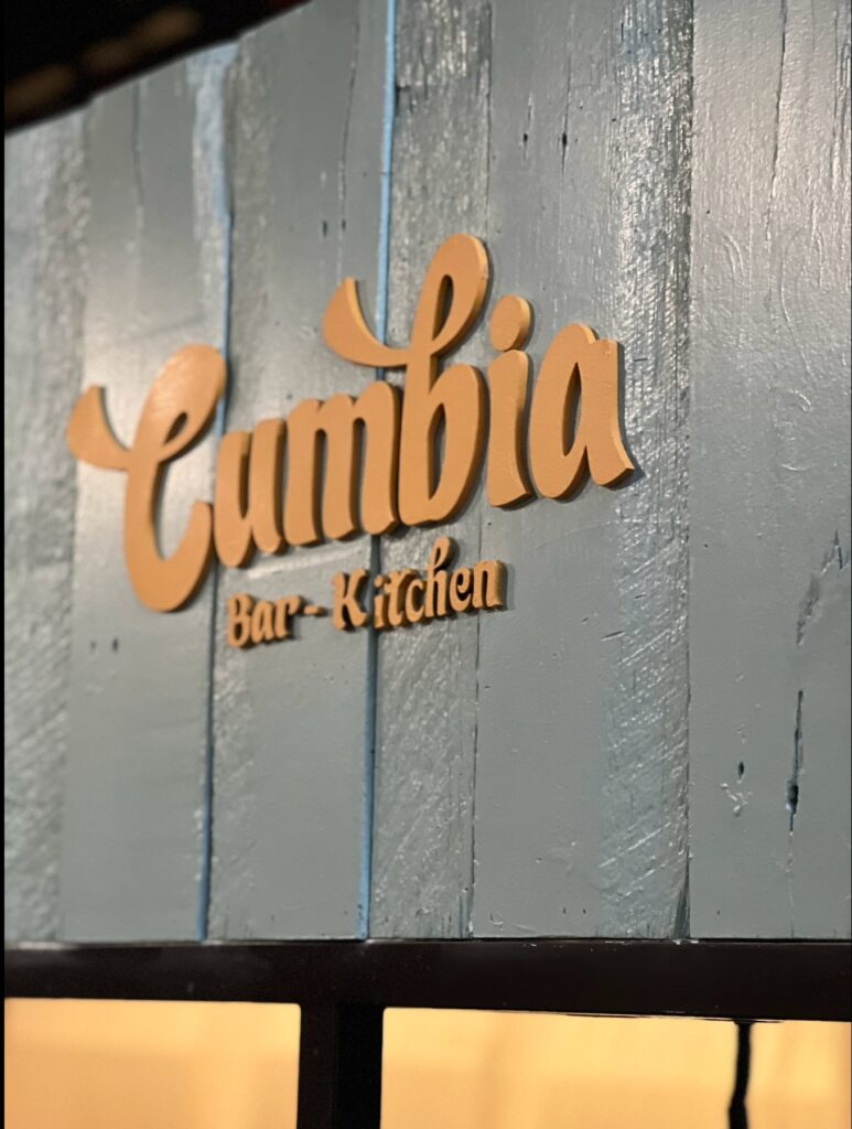
The Cumbia logo and the PAELLA sign were laser-cut for texture and visibility, then fixed in place.
WATCH THE REVEAL
See the Before & After
Watch both Cumbia stalls go from rustic folk art to a clean, modern brand that stands out in the market.
We share the making of every project on TikTok and Instagram, so you can see exactly how your space would be transformed.
@diegodalo_creative 🎨 New Project Unveiling! 🎨 This one was both challenging and exciting! Cumbia, a vibrant brand at the Adelaide Central Market, trusted us to help them create stronger brand awareness and connect with their visitors. The task? Transforming two food stations into an engaging and visually striking experience. Our approach focused on unifying the colour palette and putting the brand front and centre. We kept the design minimalist, allowing Cumbia’s logo to truly shine. Plus, we added the word “Paella” to one station for clarity, making it clear what deliciousness is on offer! A huge thank you to Cumbia for believing in our vision. We’re so proud of the transformation—small changes, big impact. 💬 What do you think of the before and after? Let us know in the comments! 📢 Need help building a stronger brand presence for your business? Contact us today for a free consultation! Let’s work together to bring your vision to life. #BrandTransformation #AdelaideCentralMarket #Paella #Cumbia #BeforeAndAfter
♬ Live Your Beautiful Life – Gray Griggs
THE RESULT
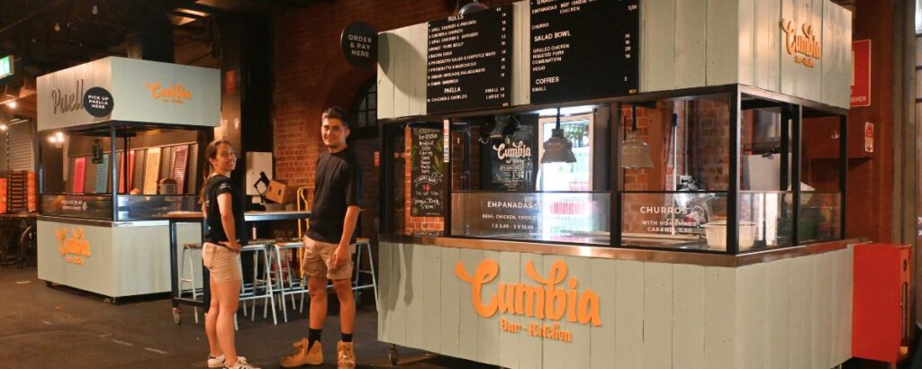
One of the Market’s Most Striking Brands
Clean colours, a logo you can spot from anywhere and a sign that tells hungry visitors exactly what’s cooking.
THE STORY BEHIND IT
Why Strategy Beat a Quick Fix
This project worked because the owners trusted a clear, reasoned proposal: listen first, then back every idea with market context and real examples.
Read the full story of how a simple touch-up became a complete rebrand on our blog.
YOUR BUSINESS
Ready to Stand Out?
From market stalls to shopfronts and cafes, we help local businesses turn their space into a brand experience.