
THE PROJECT
Coffee Shop Branding, From Brand Book to Space
A brand relaunch brought to life across a whole new coffee shop: colour, a giant mountain mural, custom lettering, signage and a brand-new facade.
Client
KOM Coffee Roasters
Location
Anzac Highway, Adelaide
Scope
Interior, lettering, signage & facade
Year
2025
THE BRIEF
A New Identity, a New Home
KOM Coffee Roasters, Colombian coffee specialists, had a brand-new identity created by an external agency and a brand-new shop to open. They asked us to bring that identity off the page and into the physical space.
Working from their brand book, we developed proposals and mock-ups for the new coffee shop, with the creative freedom to decide how the colours, graphics, lettering and brand elements would live on the walls.
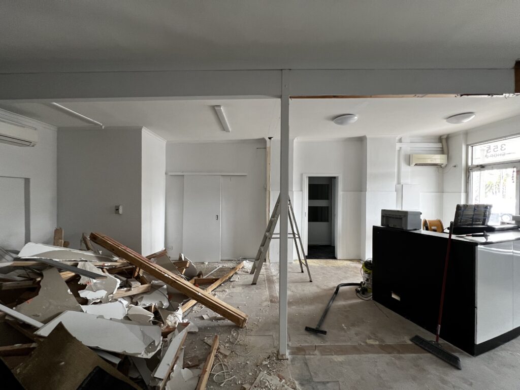
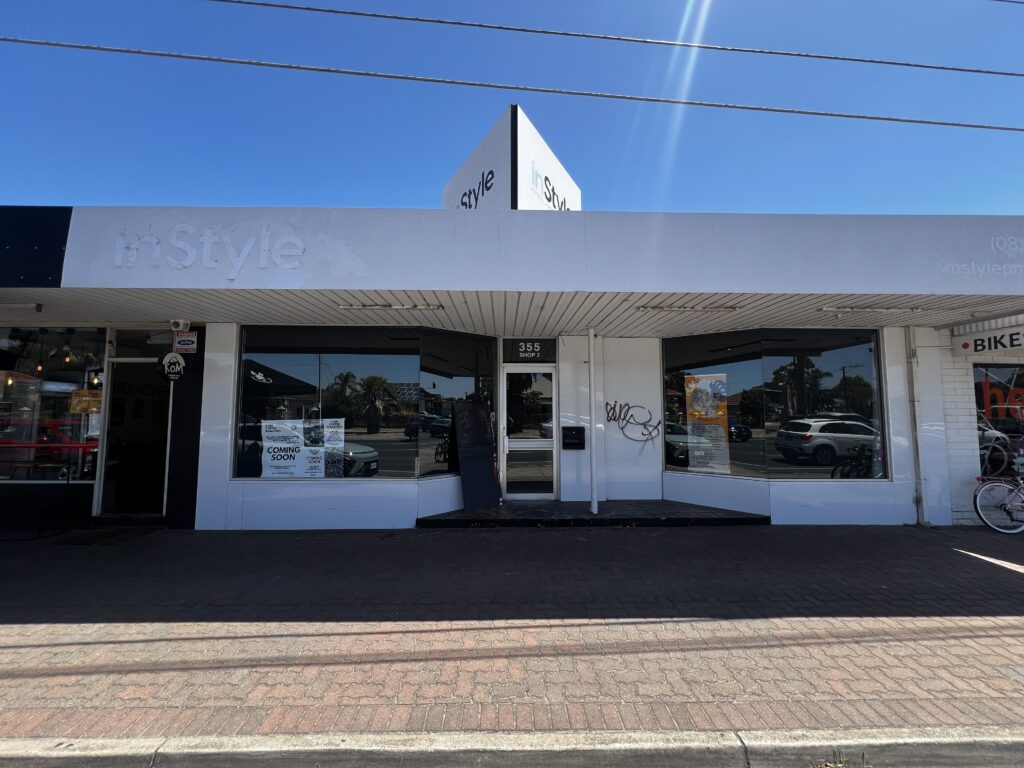
The shop started as a bare shell, with walls to knock down and a facade still showing traces of the previous business.
THE MOUNTAIN LINES
The Brand Graphic, at Wall Scale
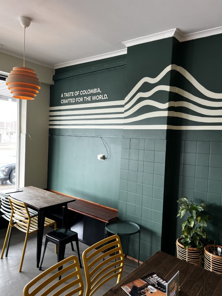
One of the key elements of the KOM identity is a graphic of mountain lines. We took it from the brand book and painted it at large scale across the walls.
Horizontal lines rise and fall to form the profile of a mountain, tying the whole space back to the brand’s name: King of the Mountains.
The small tagline from the original identity was scaled up so it reads clearly from anywhere in the coffee shop: “A taste of Colombia, crafted for the world.”
We made deep green the hero of the interior, moving away from the classic black-and-white coffee shop look and giving KOM a warm, distinctive space.
THE PROCESS
Built Together, Step by Step
From demolition to the final sign, this was a true team effort with the owners.
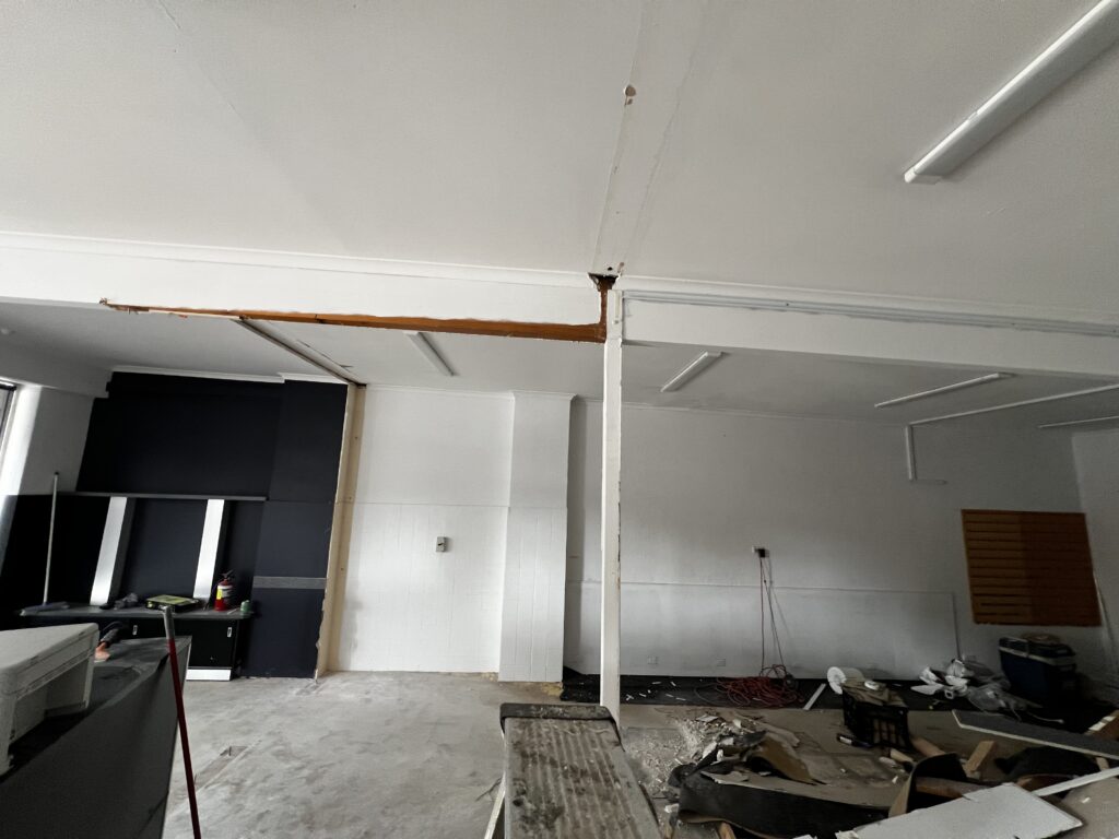
1. Demolition
The owners rolled up their sleeves too, knocking down walls and clearing the space for the new coffee shop.
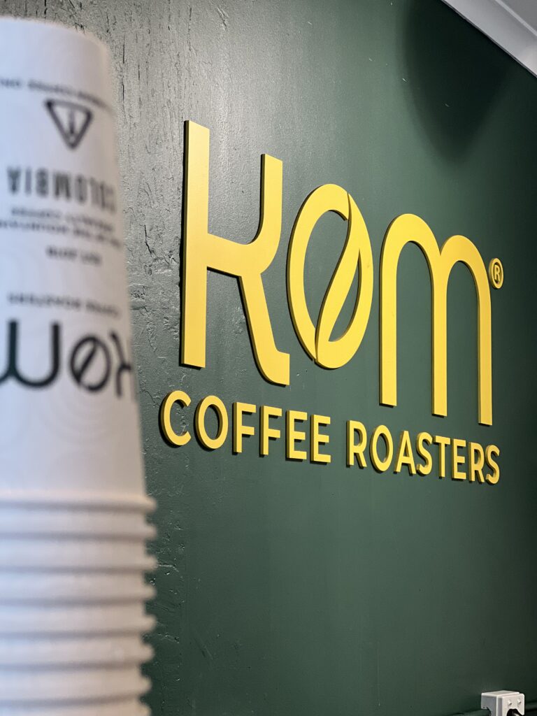
2. Custom lettering
The KOM letters were cut from 3mm MDF and spray-painted by hand in the brand colours.
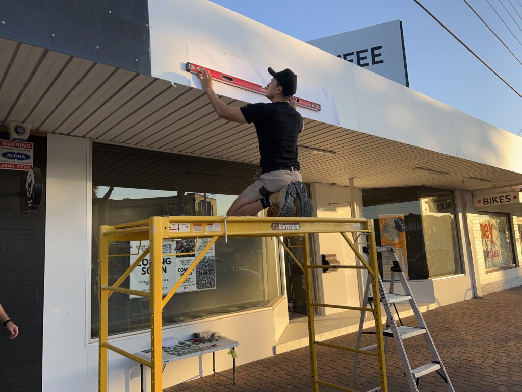
3. Facade layout
Every line of lettering was measured and levelled on the facade before a single letter went up.
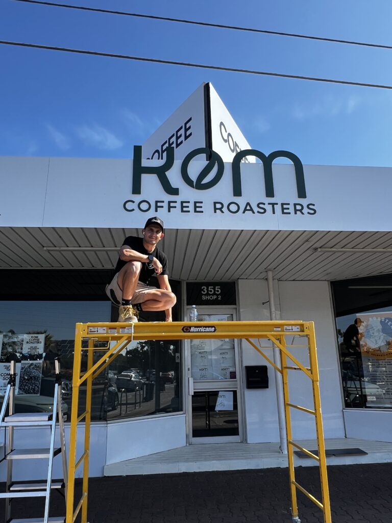
4. Installation
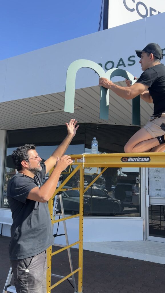
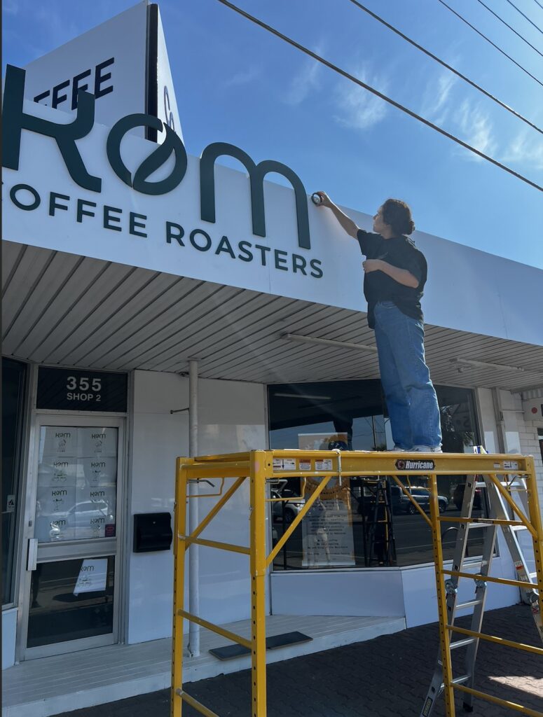
With the owners’ help, we installed the signs inside and out, from ladders to scaffold.
THE FACADE
A Smarter Solution for the Shopfront
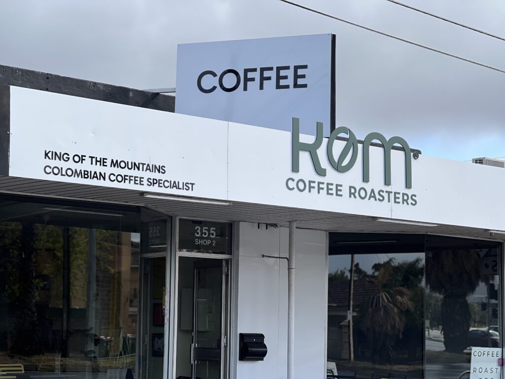
After the old signage came down, traces of the previous brand were still visible. Rather than replacing the whole structure, we reused the existing panels, priming them and painting them white to create a clean new base.
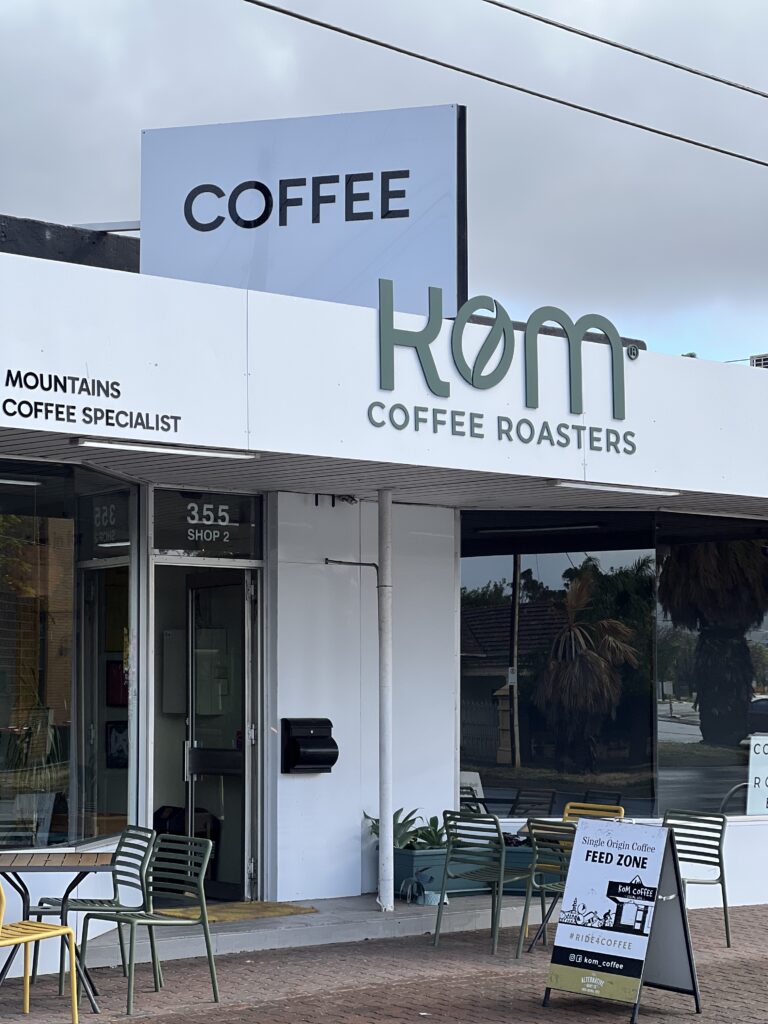
On top, we built a new two-layer acrylic sign painted in the brand colour for extra depth and presence, and added “KING OF THE MOUNTAINS”, “COLOMBIAN COFFEE SPECIALIST” and “COFFEE” so the brand is visible from every direction.
THE RESULT
A Coffee Shop That Feels Like the Brand
Deep green walls, golden lettering behind the counter and mountain lines that run through the space. The roasting room got its own identity too, in golden yellow with the KOM symbol and “COFFEE ROASTERS”.
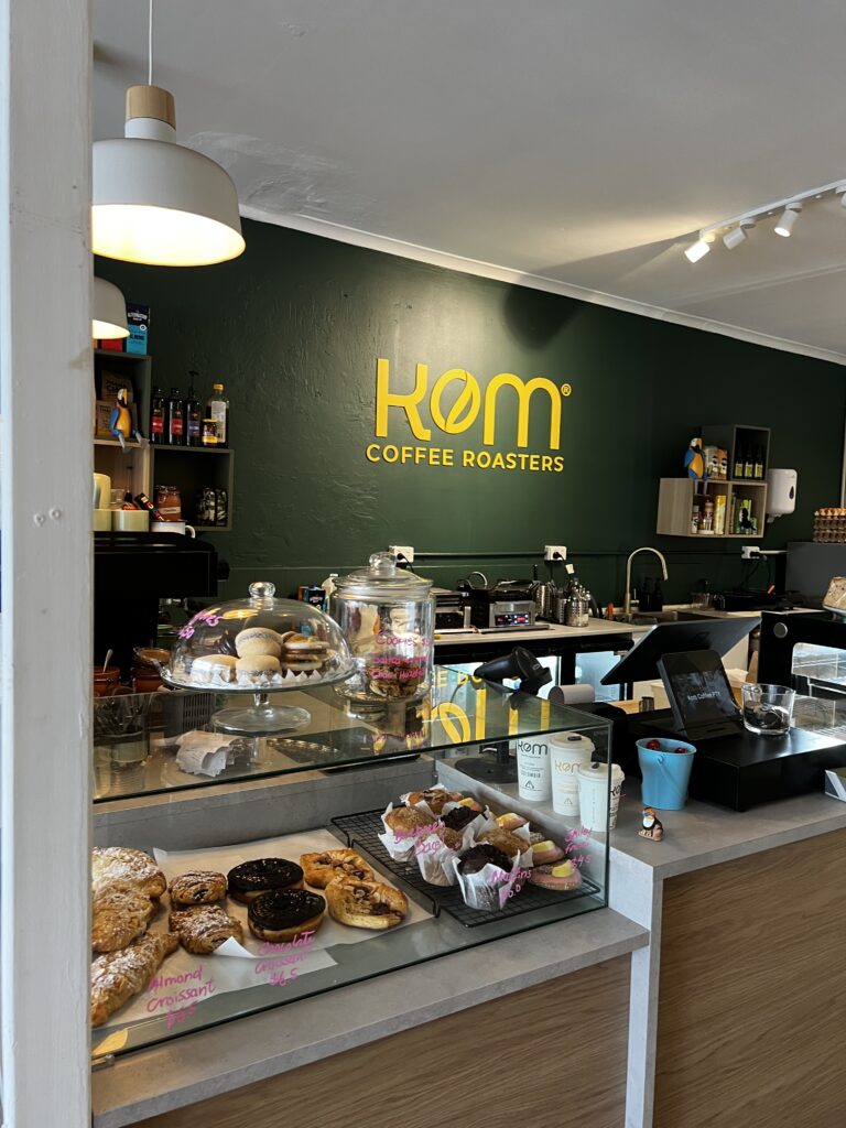
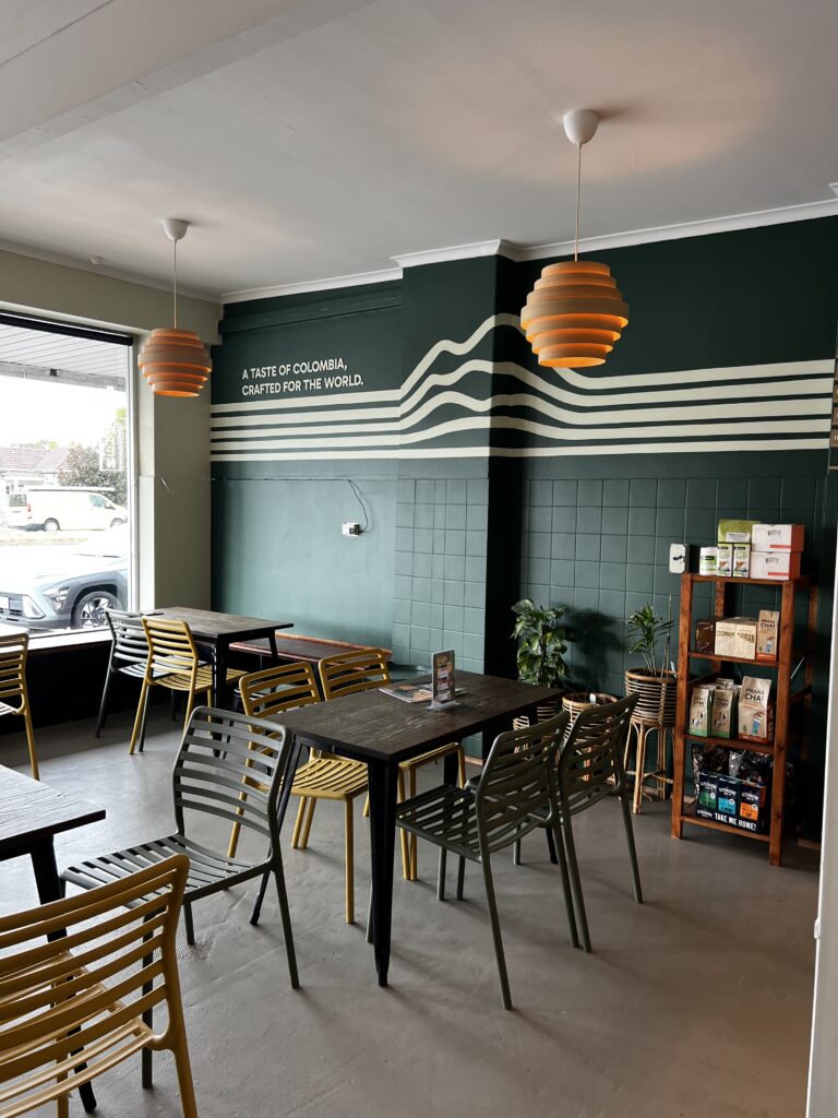
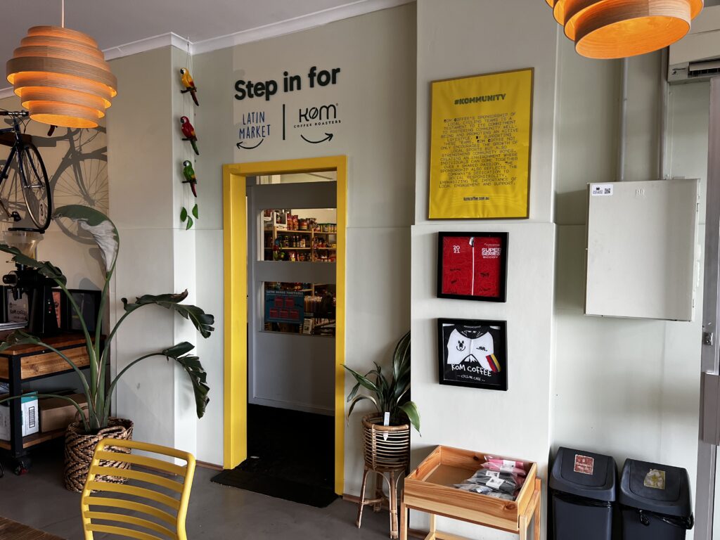
From a bare shell to a green, golden, mountain-filled coffee shop. Watch the full transformation on Instagram.
TEAMWORK
It Felt Like Our Coffee Shop Too
This project was a true collaboration. The owners worked incredibly hard alongside us, from knocking down walls to taking down old signs and helping install the new ones.
The owners were on the scaffold with us right to the end. To celebrate that teamwork, we gave one of them the honour of installing the very last piece of the sign.
Working that closely, something special happened. For a moment it felt like the coffee shop was ours too. That sense of belonging is what made KOM one of the most rewarding projects we’ve worked on.
ROUND TWO
They Called Us Back
After the first coffee shop, KOM Coffee Roasters asked us to bring the brand to a second location in the city. We painted the KOM letters again and adapted the mountain line graphic, keeping the visual language consistent across both spaces.
CLIENT FEEDBACK
★★★★★
“A huge thank you to this incredible team who worked tirelessly to bring our vision to life. Your talent, dedication and passion shine through in every detail. Our new look is visually stunning, makes us feel warm and it gives us a sense of home.”
Kings of The Mountain
KOM Coffee Roasters, via Google
YOUR BRAND
Have a Brand That Deserves a Space?
Whether you have a brand book or just an idea, we’ll bring it to life on your walls, windows and shopfront.